Description
I extensively explored Singapore Airlines' ratings across various categories such as cleanliness, food, and in-flight services. Following that, I transformed the dataset into an interactive dashboard to visually communicate key insights to end users.
Skills Applied: Excel, Tableau
Implementation
- Apply advanced nested if-else functions in Excel to generate an additional column that enhances data analysis capabilities.
- Utilizing Tableau, with the intention of streamlining the analysis breakdown and facilitating easier comprehension and exploration of insights.
Breakdown
Excel
Data Cleaning
- Given the dataset's numerous columns, my focus was on presenting the data in a clear and concise manner to facilitate effective analysis.
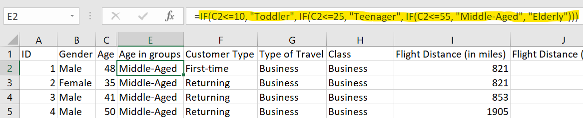
- Upon conducting a thorough review, I discovered that the "Age" column was not optimized for further analysis.
- Through the implementation of a nested if-else function, a new column was generated to categorize ages into specific age groups. This approach simplifies the subsequent analysis of the project.
Tableau
Create Dashboard
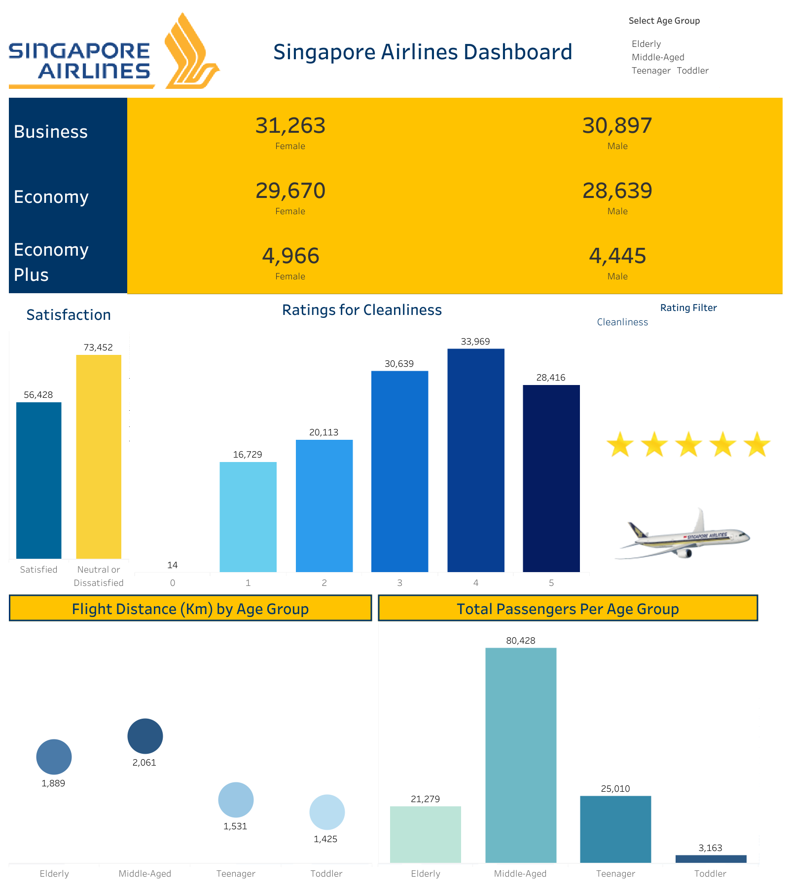
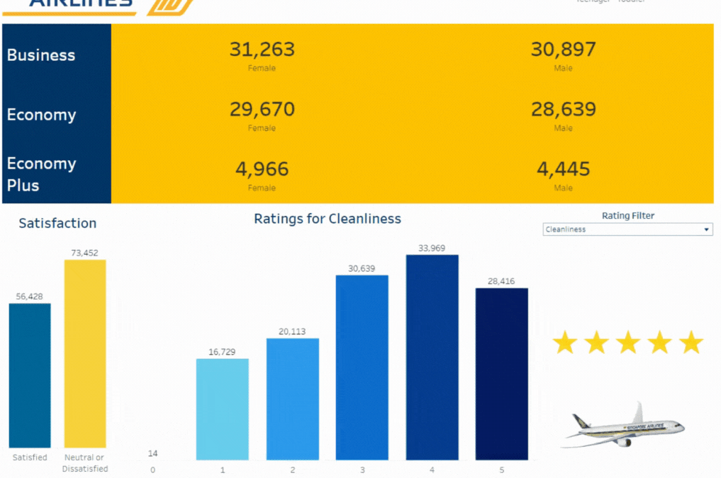
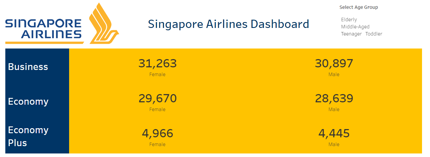
- In order to improve accessibility and facilitate easy reference to the information, I leveraged Tableau to construct a user-friendly and interactive dashboard.
- To enhance the level of interactivity in the dashboard, I incorporated dynamic filters into relevant charts for maximum engagement.
- By implementing parameters and calculated fields on particular dimensions, I improved the visualization aspect, allowing end users to dynamically view specific rating graphs based on their chosen filters.
Preview