Description
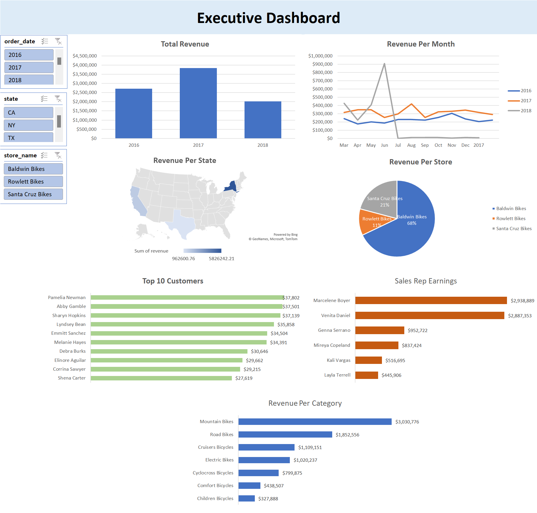
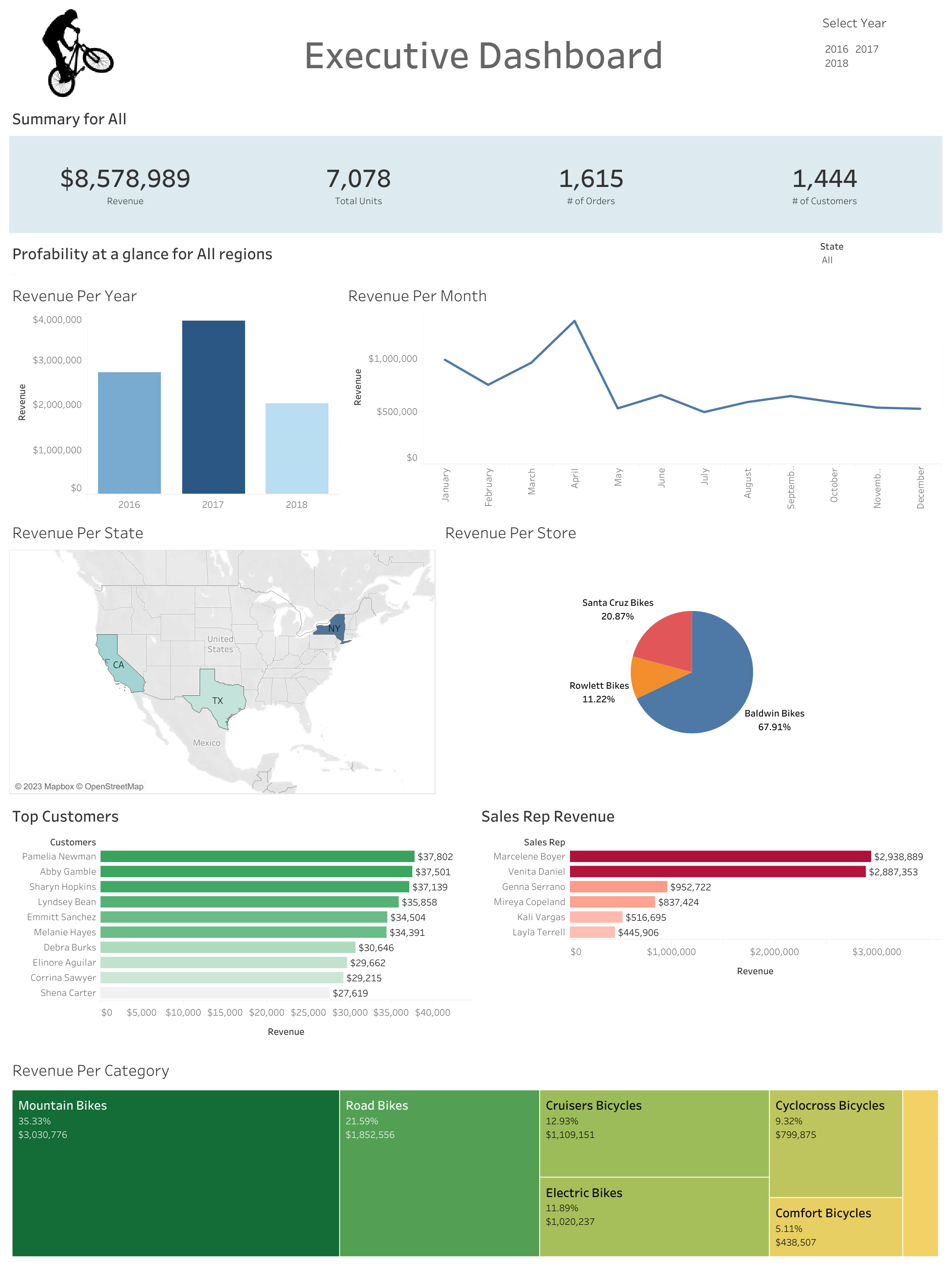
I developed interactive dashboards that provide a comprehensive view of BikeStores' revenue breakdown across various factors, such as store name, yearly, monthly, and more.
Skills Applied: SQL, Excel, Tableau
Implementation
- Demonstrated proficiency in SQL for data exploration, employing various functions like JOIN, WHERE, CONCAT, and SUM to extract and transform relevant columns, enabling informed analysis.
- Leveraged Excel's powerful Pivot Tables to import and analyze the SQL dataset, effectively creating visually engaging charts. Merged multiple charts into a comprehensive dashboard, enhanced with Slicers to make the dashboard interactive.
- Went the extra mile to showcase skills by developing an additional dashboard using Tableau, further exemplifying expertise in data visualization.
Breakdown
SQL
.png)
- In the initial stages of my project, I began by examining multiple tables and analyzing the necessary columns required for its implementation.
- Subsequently, I employed the JOIN function, also known as INNER JOIN, to merge disparate tables by leveraging their interconnected columns.
- Additionally, I utilized the GROUP BY and ORDER BY clauses to ensure that my aggregate functions yield the desired output.
- Lastly, through the implementation of the SELECT FROM function, I specified the columns that I wished to include in the resulting table.
Excel
1. Importing Dataset to Excel
.png)
- In the subsequent phase, I opted to employ Excel as my tool of choice for crafting a comprehensive dashboard.
- Firstly, I imported my SQL dataset into Excel by carrying out the following steps: Get Data -> From Database -> From SQL Server Database
- Excel will then display my exact dataset which I setup using SQL as shown below.

2. Create Pivot Tables

- Subsequently, I proceeded with the creation of the necessary Pivot Tables that would serve as foundational components for the subsequent development of my dashboard.
3. Create Dashboard

- I established a distinctive title for my dashboard, encapsulating its purpose and providing a clear identifier for users.
- Next, I strategically organized and optimized the arrangement of charts within the dashboard to effectively communicate information to stakeholders.
- Finally, I leveraged the use of Slicers to enhance the interactivity of the dashboard, empowering stakeholders to dynamically explore and analyze the data according to their specific needs and preferences.
Tableau
Alternative Dashboard

- I extended my efforts by creating an alternative Tableau dashboard, augmenting the analytical capabilities and providing an enhanced visual experience for data visualization.
- To enhance dashboard interactivity, I incorporated dynamic filters on relevant charts, empowering users to interactively explore and refine data presentation based on their specific needs.
